
Struggling with presenting survey results in PowerPoint? Not sure how to present survey results in PowerPoint in ways that are easy and quick? It’s a common challenge: turning a spreadsheet of numbers into a compelling visual story. Before we delve into solutions, let’s address the core issues:
- Audiences can easily get overwhelmed by raw data.
- Essential insights often get buried in charts and graphs.
- Keeping the presentation interactive and engaging is not straightforward.
Now, how can we overcome these obstacles and captivate our audience? The answer lies in a combination of innovative tools and presentation techniques, which we will explore next.
How to Present Survey Results in PowerPoint: Quick Suggestions
- ClassPoint Quick Poll: Run live polling in PowerPoint and display the survey results instantly to your audience.
- Infographics and Data Visualization: Utilize infographics to make complex data more understandable. Tools like PowerPoint’s built-in chart and graph features can help you create visually appealing representations of your survey results.
- Interactive PowerPoint Slides: Incorporate interactive elements like hyperlinks, triggered animations, or embedded videos to make your presentation more engaging. These features can illustrate your survey findings in a dynamic way.
- Storytelling with Data: Use a narrative structure to present your survey results. This involves setting up a storyline where data points are introduced as part of a larger narrative, making the presentation more relatable and memorable.
- Comparative Analysis: If your survey results are comparative in nature, use side-by-side comparisons, before-and-after snapshots, or trend analyzes to depict changes or contrasts effectively.
- Animated Charts and Graphs: Animations can be a powerful tool in highlighting specific parts of your data. Animated bar charts, pie charts, or line graphs can draw attention to key findings in your survey.
3 Insanely Quick and Easy Ways on How to Present Survey Results in PowerPoint!
Presenting survey results effectively requires more than just sharing data; it involves storytelling, visual impact, and audience engagement. Whether you’re an educator, a business professional, or a researcher, the way you present your findings can significantly influence your audience’s understanding and reaction.
Today we are sharing with you 3 insanely quick and easy shortcuts to present survey results in PowerPoint 👇
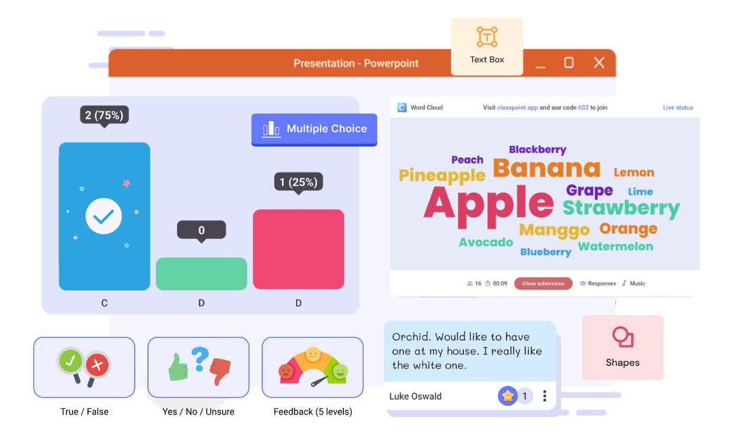
1. ClassPoint Quick Poll
The first and more effortless method of presenting survey results in PowerPoint is through running a live poll in PowerPoint, then displaying the results instantly while presenting. This method combines conducting a live poll and presenting the survey result into one seamless act.
Here’s how you can do it 👇👇
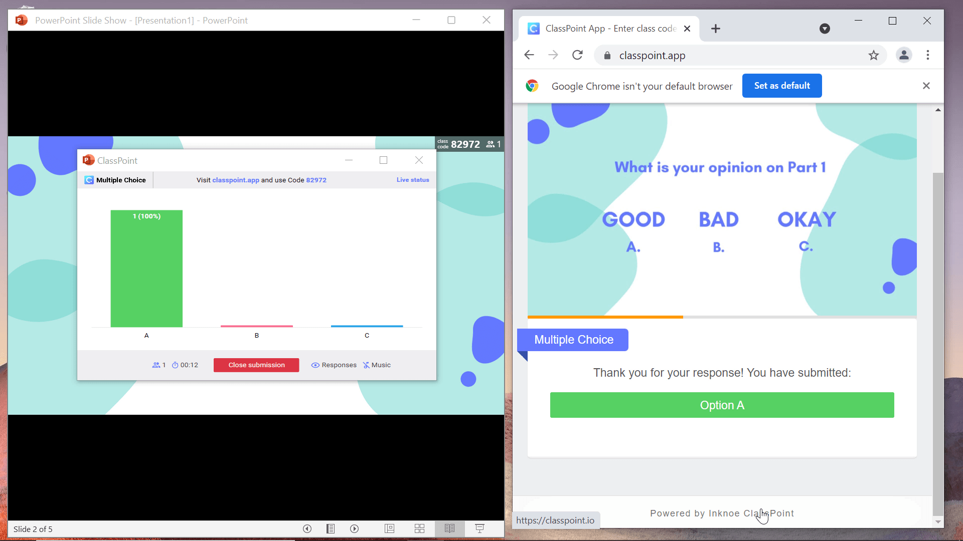
- Step 1: Install the ClassPoint add-in for PowerPoint.
- Step 2: Launch any presentation slides and enter slide show mode.
- Step 3: Click on “Quick Poll” on the ClassPoint tab at the bottom of your screen and choose from three poll types: true or false, yes or no, and agree or disagree to launch the poll.
- Step 4: Audience can join your poll at classpoint.app and the poll and survey results will be immediately displayed on your slide.
Benefits of ClassPoint Quick Poll
- Ease of Use: ClassPoint’s Quick Poll integrates seamlessly with PowerPoint, allowing for instant poll creation without the need for external apps or tools.
- Diverse Poll Types: Choose from True/False, Yes/No/Unsure, Feedback polls, and Custom polls to suit the nature of your survey data.
- Real-Time Engagement: Engage your audience by receiving immediate responses, making your presentation dynamic and interactive.
This intuitive tool significantly enhances audience interaction and the visual impact of survey data in your PowerPoint presentations. Want more? Explore 30 innovative ways to use ClassPoint!
Pro Tip: Engage further by asking follow-up questions based on the poll results. This keeps the momentum going and deepens the interaction, showing your audience that their input is valued and directly influences the flow of the presentation.
2. Presenting Survey Results Using Charts
The Traditional Way
Charts provide a clear and concise way to present your survey data. PowerPoint’s array of chart options allows you to tailor your data presentation to your audience’s needs.
Here’s a quick step-by-step guide:
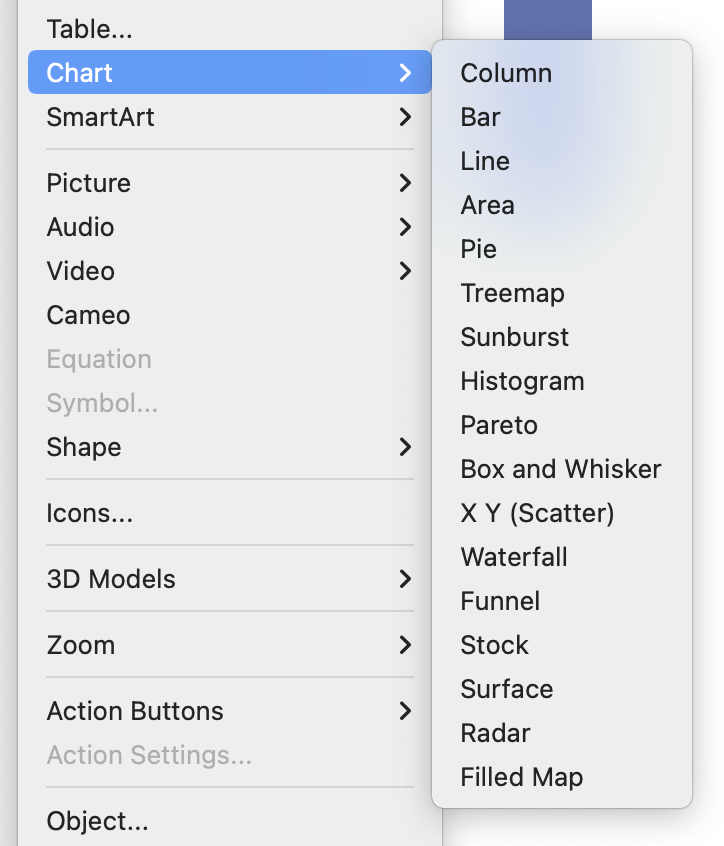
- Step 1: Select the data for your chart.
- Step 2: Go to the ‘Insert’ tab in PowerPoint and choose ‘Chart’.
- Step 3: Pick the chart type that best represents your data.
- Step 4: Customize the chart’s design and format it to fit your presentation style.
- Step 5: Insert the chart into your presentation and use it to tell the story behind your data.
The Pro Way: Using PowerPoint SmartArt
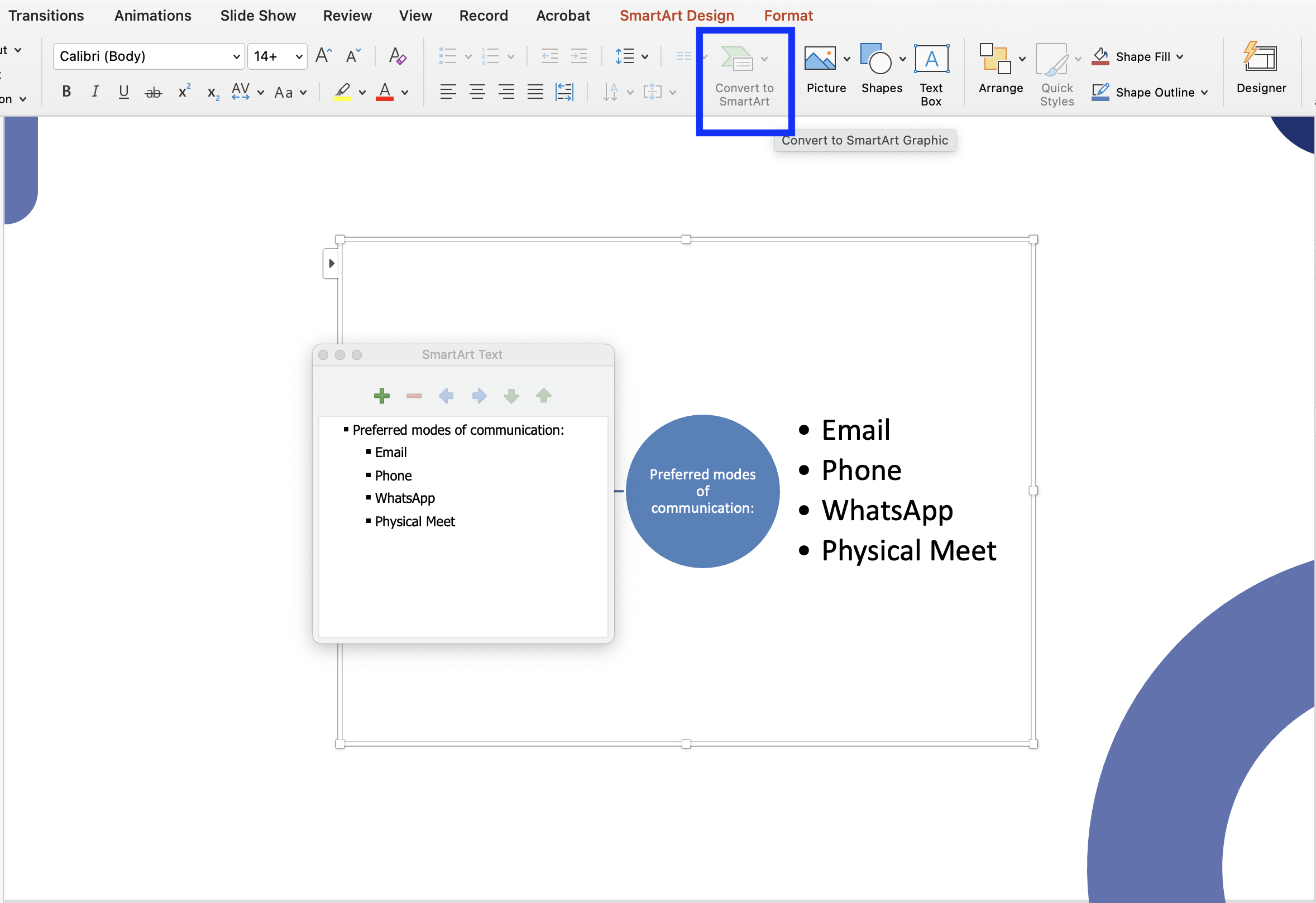
- Step 1: Type your data as texts or bullet points in PowerPoint.
- Step 2: Navigate to PowerPoint ribbon and select ‘Convert to Smart Art’.
- Step 3: Next, choose the desired chart or graph.
Alternatively, you can also select ‘Smart Art’ under the ‘Insert’ and select from a range of pre-designed charts or graphs, then insert the survey data accordingly.
3. Presenting Survey Results Using Animations
Animations can bring your data presentation to life. With PowerPoint’s animation features, you can take your survey result presentation up a notch. There are many ways you can animate your charts, but in this article, we will be sharing with you a cool way of animating your survey results in the style of a donut chart:

- Step 1: Add the shape ‘Arc’ to your PowerPoint slides.
- Step 2: At the settings panel, change the ‘Cap Type’ to ‘Round’, and adjust the width to your liking.
- Step 3: Select the “Wheel” animation effect from your PowerPoint ribbon.
- Step 4: (Optional): Add an ellipse at the tip of the wheel to make the animation more seamless.
More on interactive data visualisation here.
FAQs on How to Present Survey Results in PowerPoint
When it comes to presenting survey results in PowerPoint, several questions often arise. This FAQ section aims to address some of the most common inquiries, providing clear and concise answers to help enhance your presentation skills.
How can I make my survey results stand out in a presentation?
To make survey results stand out, use a mix of visual aids like charts, graphs, and infographics. Tailor the design to your audience and ensure that the key findings are highlighted clearly and concisely.
What are some effective ways to keep my audience engaged during the presentation?
Engage your audience by incorporating interactive elements like live polls, quizzes, or Q&A sessions. Also, use storytelling techniques to weave your data into a compelling narrative.
Can I use animations effectively in presenting survey data?
Yes, animations can be used effectively to draw attention to specific data points. However, use them sparingly to avoid distracting from the main message.
Is it important to customize PowerPoint templates for survey presentations?
Customizing PowerPoint templates helps in aligning the design with your presentation’s theme and makes your data more accessible and understandable to the audience.
Elevate Your Presentations Today: Embrace ClassPoint’s Quick Poll
Ready to revolutionize how you present survey results? Embrace the power of ClassPoint’s Quick Poll to make your presentations more interactive and insightful. Here’s how you can get started:
- Experiment with different poll types to find what best suits your audience.
- Analyze the results in real-time for a more dynamic presentation.
- Use the feedback to refine your approach and content.
