
Did you know there’s an actual term for fear of public speaking? It’s called glossophobia. And that’s exactly what we’re here to deal with.
Even the most experienced presenters get nervous before a presentation. It’s a natural reaction. Your body is bracing for the worst.
But when you’re prepared, and you’ve had time to make sure your presentation flows well from start to finish, that fear can shrink down. It won’t disappear completely, but it won’t take over either.
PowerPoint is one of the most commonly used tools for presenting. And for good reason. Even with newer presentation tools popping up, PowerPoint is still the go-to.
Creating a PowerPoint is one thing. Standing in front of people and actually presenting it is a whole other challenge. We’re here to break both down so they feel less overwhelming and more doable.
We’ve packed this blog with actionable PowerPoint presentation tips, public speaking tips, and little-known tricks that actually make a difference from setting up your presentation, up to actual delivery.
Start Strong with the Right Setup
Before you even open PowerPoint, you need to set the stage. A well-structured presentation starts way before slide design. These tips help you think ahead, save time later, and avoid awkward fixes mid-presentation.
1. Know your output screen before you start designing
Will you be presenting on a wide projector? A small classroom monitor? Online over Zoom?
Check the aspect ratio before you start building. Go to Design → Slide Size. Choose 16:9 for widescreen or 4:3 for older projectors.
Mismatch here causes slides to stretch, cut off, or add those ugly black bars.
Aha tip: If you're not sure what the setup is, design in 4:3. This PowerPoint trick is safer for older tech and scales better on smaller displays.
2. Set up your Slide Master early
Most people skip this and end up fixing fonts and layouts slide by slide. Instead, use Slide Master to lock in your fonts, colors, logo placements, and default layouts.
Go to View → Slide Master. Customize it once. Apply it to all.
You’ll save hours and your deck will look consistent without extra effort.
Aha tip: You can create multiple Slide Masters in one deck. Great if you’re mixing topics, like intro slides vs activity slides.
3. Build your structure outside PowerPoint first
Sketch it out on paper. Use sticky notes. Or outline it in Word or Google Docs.
Why? It helps you focus on what needs to be said, not how it looks right away. And it keeps you from stuffing slides with ideas that don’t need to be there.
4. Choose fonts that won’t betray you on other devices
Stick with system fonts like Arial, Calibri, or Verdana.
If you use downloaded fonts, they might break or default to Times New Roman on another laptop. If you must use a custom font, embed it.
Go to File → Options → Save → Check Embed fonts in the file
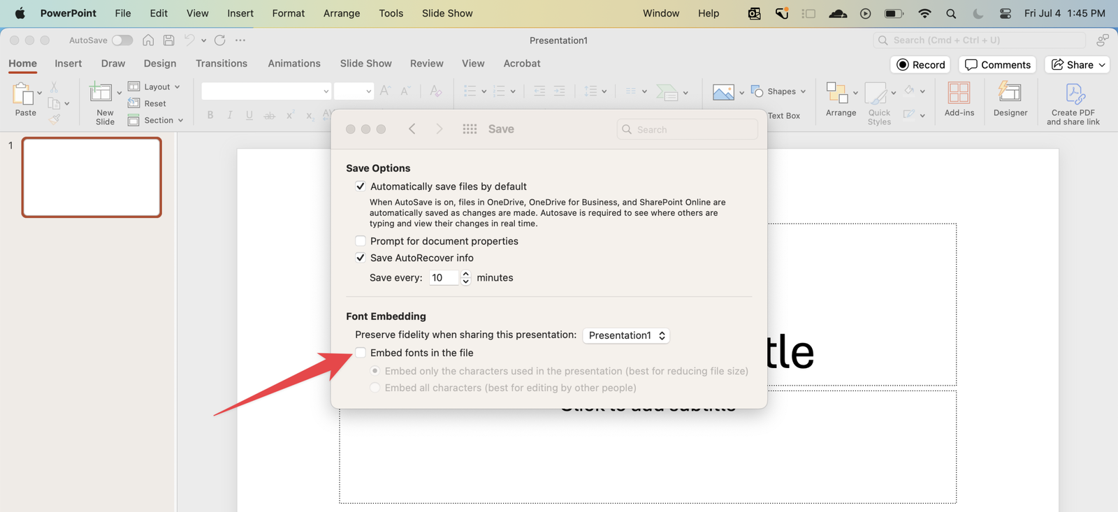
Aha tip: Don’t just embed fonts. Also test your file on a different computer before presenting.
5. Always test your deck in Slideshow mode
You might be building in Normal View, but things shift once you hit play. Run through your deck in full-screen early and often. Catch issues with alignment, images bleeding out, or animations that feel too slow or too fast.
PowerPoint Design Tips
Good slide makes your message easier to absorb. And no, it doesn’t mean adding more visuals. It’s about intentional layout, and just the right breathing space.
6. Stick to one main idea per slide
Trying to explain too much on one slide forces your audience to choose between listening to you and reading. Choose one key point, and if you have more, break it up into separate slides. It’s easier to follow and looks more professional.
Aha tip: Use the “two-minute rule.” If you can’t explain a slide’s content in under two minutes, split it up.
7. Use alignment like a designer
Avoid dragging elements around freely. Instead, use PowerPoint’s alignment tools to snap things into place.
Select your objects → Shape Format → Align
Use Align Left, Align Middle, or Distribute Vertically for clean lines and balance.
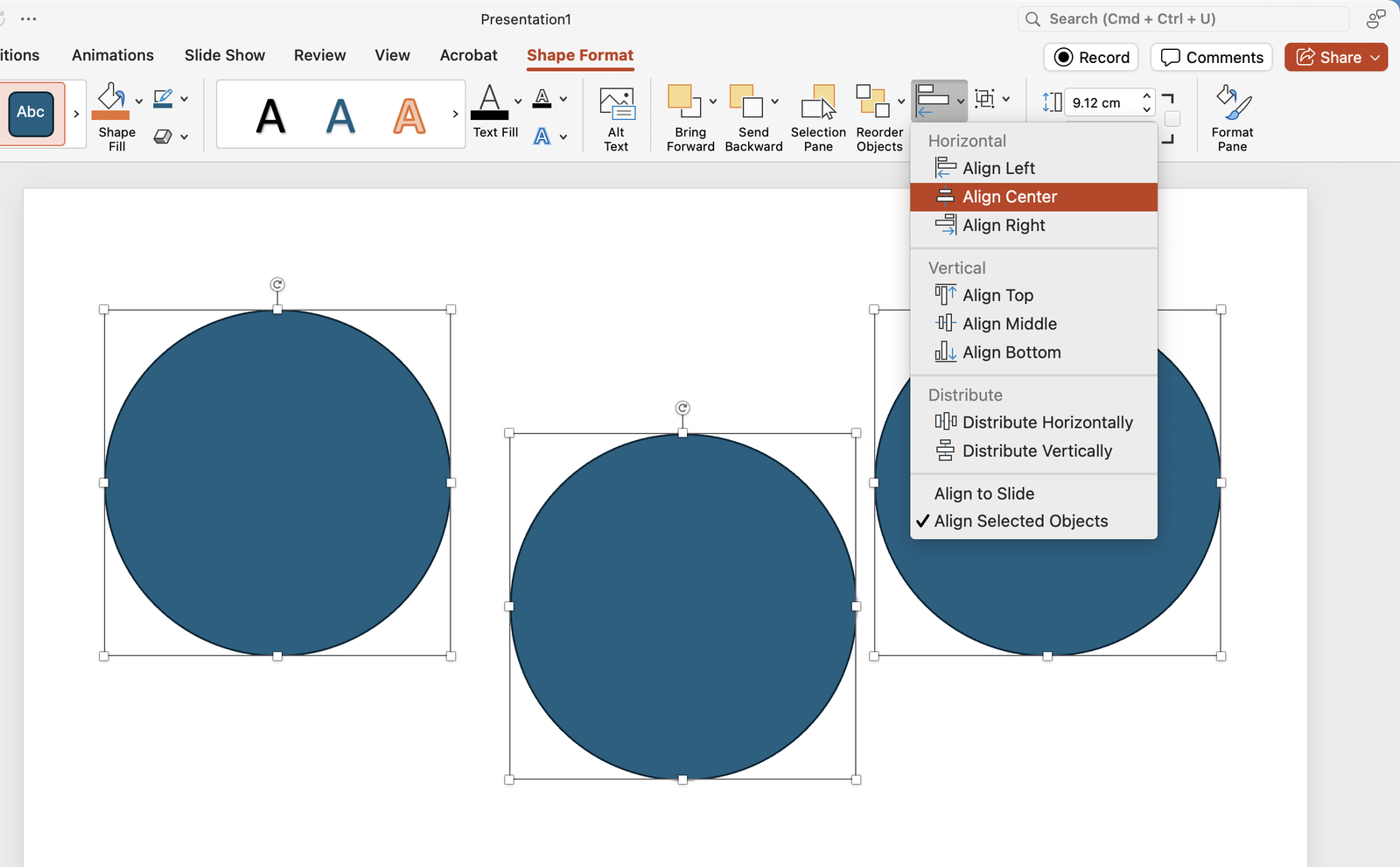
Aha tip: Turn on Gridlines and Guides under View. This PowerPoint trick gives you invisible anchors while designing.
8. Choose high-contrast color combinations
Black text on white or light text on a dark background is safest. Avoid red-green or blue-purple combos, especially in settings where projectors wash out color. And always test how it looks in a bright room.
Aha tip: Paste your slide into grayscale mode (via Print Preview) to test contrast. If it still reads well, you’re good.
9. Reserve animations for meaning
Animations should guide attention, not distract. Stick to Appear, Fade, or Wipe. Skip Swivel, Bounce, and anything that makes your audience wait unnecessarily.
Aha tip: Instead of using bullet points all at once, animate each point to appear on click. This keeps your pacing tight and avoids TL;DR syndrome.
10. Keep fonts clean and consistent
Use a maximum of two fonts. One for headings, one for body. Make sure both are readable from the back of a room or on a small screen.
For quick readability, use minimum font sizes:
- Heading: 36 pt
- Body: 24 pt
Anything smaller risks becoming invisible during live presentations.
11. Use whitespace generously
Don’t cram the slide with content edge to edge. Give your elements breathing room so your audience knows what to look at first.
Aha tip: Think of your slide like a billboard. If someone only sees it for 5 seconds, would they get the message?
12. Turn any object into a clickable button
Need to create navigation between sections? Insert a shape or image → Right-click → Link → Place in This Document → Select a slide.
Now you’ve got in-slide navigation without fancy coding.
Aha tip: Works great for interactive quizzes or menu-style slides.
13. Use the Eyedropper tool to match brand or theme colors
No need to guess hex codes. Select any shape → Shape Fill → Eyedropper → Click on any color on your screen.
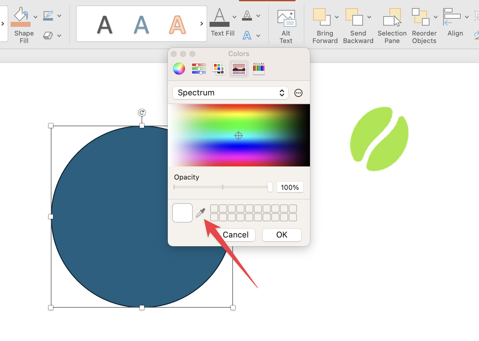
Your slides instantly feel more cohesive.
14. Lock objects in place
Ever accidentally nudge a background element while working? You can right-click any object → Lock.
No more accidental mess-ups.
Aha tip: Especially helpful for logo placements, decorative lines, or background shapes you don’t want to touch again.
Make Content Easy to Follow and Remember
Your content is what sticks. When your slides are too dense or all over the place, your audience either zones out or scrambles to keep up. These presenting tips help your message land and stay there.
15. Write for the ear, not the eye
Most people read slides like a document. But your audience is listening, not studying. Use simple, spoken language instead of textbook terms or chunky phrasing.
Aha tip: Read your slides out loud. If it sounds awkward to say, it’s awkward to read too.
16. Use bullet points like signposts
Don’t list everything. Use 3–5 points max, and write in phrases, not full sentences. This gives your audience something to glance at while they focus on you.
Aha tip: Start bullets with strong verbs. It adds energy and improves retention.
17. Pair visuals with your most important ideas
Charts, icons, or even a simple photo can reinforce your point more effectively than a paragraph can. But make sure it’s relevant. Decorative graphics add clutter.
Aha tip: Use SmartArt for quick diagrams that show relationships, cycles, or comparisons, without needing to design from scratch.
18. Bold and highlight with intention
Don’t bold for decoration. Use bold text to signal what to pay attention to. One bold phrase per slide is more impactful than highlighting everything.
Aha tip: Pair bolding with color sparingly to create a clear visual hierarchy.
19. End key slides with a takeaway
Instead of wrapping with “Any questions?”, end important sections with a one-liner takeaway. This gives your audience something to latch onto, even if they forget the rest.
Aha tip: Create a slide template with a bold heading like “What to Remember” or “Why This Matters” for built-in reflection.
Keep Your Audience Engaged Throughout
Even the best-designed slides won’t matter if your audience zones out halfway through. Interaction is what keeps people awake, and thinking.
20. Turn passive viewers into active participants
In PowerPoint, you can do more than just say things. With ClassPoint, you can embed quizzes directly into your slides to make an interactive PowerPoint.
Participants can respond from their devices instantly. And you see live results, right there in your slideshow.
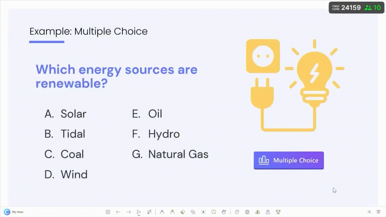
How it works: Click on any slide, choose a quiz type from the ClassPoint tab on your PowerPoint ribbon (like Multiple Choice or Short Answer), and launch it during presentation mode. It blends right in with your slides, so the focus stays on your content.
21. Use visual prompts to trigger engagement
Add slides that are made for interaction. Examples:
- “Upload a photo of….”
- “What’s your first thought when you see this?”
- “Spot what’s wrong here”
With ClassPoint, you can use the Image Upload or Slide Drawing activity to let participants respond with images, sketches or annotations, right from their phones or laptops.
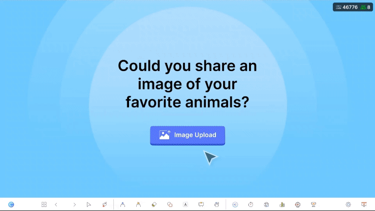
Aha tip: This PowerPoint trick is great for brainstorming, problem-solving, and letting quiet participants express themselves without needing to speak.
22. Add friendly competition (but keep it light)
Sometimes, a little game element is all it takes to boost energy in the room.
With ClassPoint, you can turn any quiz slide into a mini game. Participants earn stars when they get answers right, and you can choose who gets rewarded manually or automatically. Over time, those stars add up, and with enough of them, participants level up and earn badges.

23. Use name randomizer to invite quieter voices
Worried the same few people are always speaking up? Use ClassPoint’s built-in PowerPoint Wheel of Names to call on participants randomly. It’s built into your slideshow toolbar, so you don’t need to prep anything ahead.
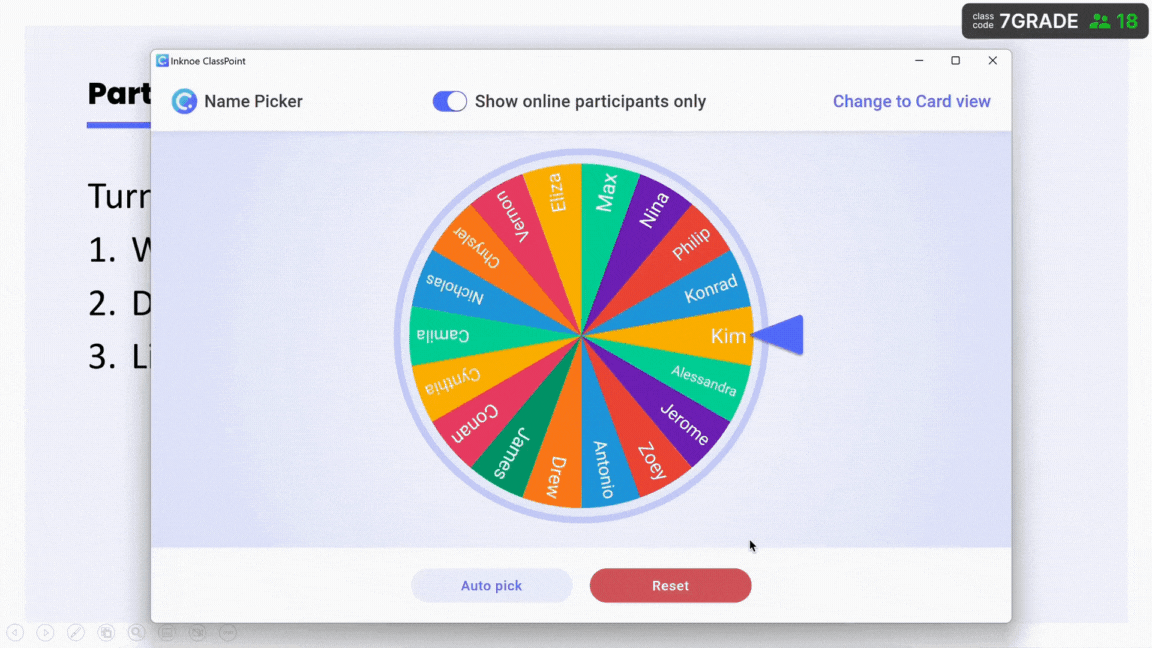
Aha tip: Switch in between wheel, card, and auto-pick modes to add variety to name-picking.
PowerPoint Presentation Tips for Confident Delivery
This is where everything comes together. Your content. Your design. Your timing. But even the most polished deck can fall flat if the delivery feels off. Here are delivery tips that go beyond “don’t read your slides”.
24. Use Presenter View with confidence, but edit your notes like a script
Presenter View is helpful. But raw notes often look like an afterthought. Format them like a mini script: break them into short chunks, bold key words, and add line breaks for natural pacing.
Aha tip: Highlight transitions in your notes like “(Pause here)” or “(Click to next slide)” so you’re not second-guessing when to move forward.
25. Teach your slides to breathe
Don’t rush. When you click to a new slide, let it sit there for 1–2 seconds before you say anything. This gives your audience time to take it in, and it signals that you’re in control.
Aha tip: Use that beat to scan the room, take a breath, or check your next talking point without looking like you’re pausing.
26. Build mental anchors with consistent phrasing
Create repeatable phrases for key ideas. For example, if you’re presenting a three-part framework, use the same intro line every time: “Here’s what this looks like in practice…” or “Step one always comes down to…”
Aha tip: Repetition builds rhythm, and rhythm builds trust. Use this presenting trick as your “slide glue.”
27. Use on-slide cues to guide your delivery
Add subtle visual cues just for yourself, like a tiny shape in the corner of a slide that reminds you this is where interaction starts or a story comes in.
They won’t distract your audience, but you’ll always know what’s coming.
Aha tip: ClassPoint icons (quiz, name picker, etc.) double as delivery cues when added to slides, they remind you to launch an interaction without needing notes.
28. Use ClassPoint’s laser pointer to pace your explanation
Instead of waving your arms or hovering your mouse around randomly, use the built-in laser pointer in ClassPoint to direct attention as you explain. It’s smooth, it works right inside PowerPoint, and it keeps the focus where it should be.
Aha tip: Easily turn your laser into a spotlight by simply hitting ‘S’ on your keyboard while laser mode is activated.
29. Build a “buffer slide” at the end of sections
Ever wrap up a section and forget what’s next? Add a blank dark slide or a slide that just says “Any questions before we move on?”
It gives you space to reset your mind, and re-engage.
30. Set the mood with a first slide that isn’t your title
Your title slide is for the audience. But your first real slide sets the tone. Consider starting with a bold visual, a one-liner quote, or a question that makes people lean in.
Aha tip: Add this as a second slide (after your title) and make it black with just one key sentence. It creates instant focus.
Quick Ways to Ruin a Presentation (Avoid These)
You’ve already covered 30 PowerPoint presentation tips that help you design better, present smarter, and keep your audience engaged. But even the best tips can’t save a presentation that falls into these traps.
Slides that look like spreadsheets
Dense tables and data dumps rarely work on-screen. If you need to share numbers, simplify or spread them out. Use charts or visuals that highlight what matters.
Animations that compete with your message
Movement for movement’s sake only distracts. Keep it purposeful. If you’re not sure why it’s there, remove it.
Talking without checking for understanding
Presenting is not one-way. Whether you’re in a classroom or boardroom, check in often. Ask a question. Run a quick quiz. Even a pause with eye contact can make a difference.
Skipping a final review
Misaligned objects. Typos. A slide in the wrong order. These slip-ups are avoidable. Run your deck from start to finish in Slideshow mode. Fix what you catch. Then run it again.
One Last Thing
These PowerPoint presentation tips are here to help you think through each part of the process from how you structure your content, to what you put on each slide, to the way you present it in the room.
Some presenting tips will save you time. Others will sharpen the way you communicate. But all of them are meant to make your message easier to understand and harder to forget.
The rest is practice.
